Analysing Unit Utilisation
Unit Utilisation analyses data for the usage of appliances (PRLs, Aerial, etc). Analysis will only be done for data that has passed the currently set filters.
Select Utilisation from the toolbar.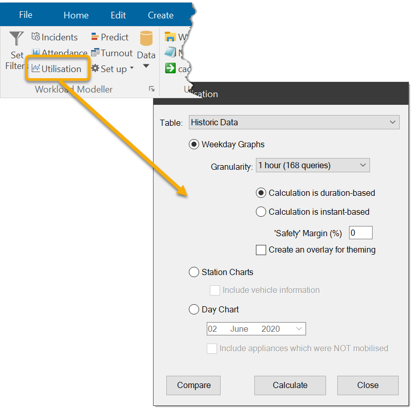
Two analysis functions are available:
- Produce day-based unit utilisation reports (tables and graphs)
- Station-based unit utilisation (colour-coded spreadsheet)
Use the Table drop-down menu to specify the data to be analysed.
Weekday Graphs displays unit utilization over a week.
The following options are mandatory and must be set:
- Granularity
- Calculation is duration-based, or
- Calculation is instant
Optional settings are:
1. Granularity
Granularity refers to the ‘fineness’ of the report, i.e. the data can be analysed at a selection of intervals ranging from 1 minute to 1 hour.
- Selecting ‘1 hour’ means the data for each weekday will be analysed in 24 ‘slices’, i.e. one for each hour of the day.
- Selecting ‘1 minute’ means the weekday data will be analysed in 1440 slices, i.e. one for each minute of the day.
Granularity determines the number of rows in the tabular data and the number of data points in the chart.
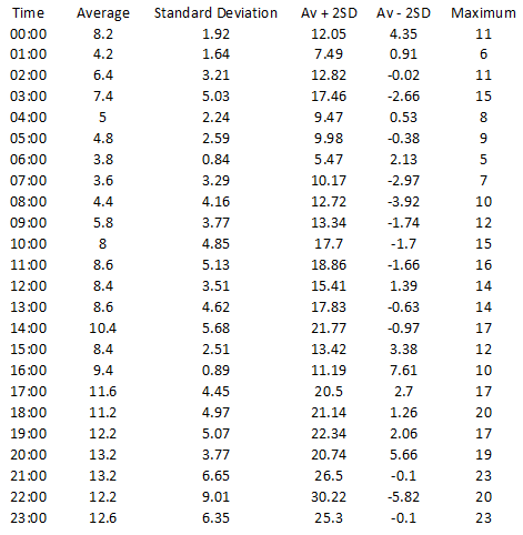
Figure 1 and Figure 2 are examples of output for a weekday where the granularity was ‘1 hour’.
2. Calculation Mode (duration-based / instant-based)
Calculation mode controls how units (appliances) are counted for each row in the weekday tables.
In this example, blue, orange and green lines represent when three appliances are in use:
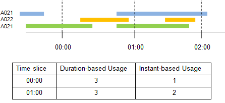
Here the first two data rows are:

Column 1 – Time shows the time slice referred to by this row.
The value is actually the time of the start of the slice. So 00:00 is 0 hours and 0 minutes after midnight; 01:00 is 1 hour and 0 minutes after midnight and so on (i.e. the first two hours of the day.)
The remaining numbers show the average usage figures for this time slice in this weekday (Sunday), i.e. the average number of appliances in use for all Sundays in the 00:00 slot is 8.2.
-
Duration-based appliances are counted if they are in-use at any time in the duration of the time slice. In this ‘1 hour’ example, appliances are counted if their usage overlaps the period 00:00:00 – 00:59:59.
-
Instant-based: appliances are only counted at the specified time.
TIP: The time an appliance is in use is determined from the ‘Assigned’ and ‘Released’ fields in the callout records.
4. Safety Margin (%)
Use this option to increase the safety margin by a percentage to raise the values in the column "AV+2SD". This can change how the AV +2SD line in the graphs are calculated.
Entered values are seen as a percentage increase (negative values are not accepted) which is applied to the values in the "AV+2SD" column.
If a Safety Margin value is entered, the values of this column are calculated as below:
Value = (Average+(2×Standard Deviation)) × (1+(Safety Margin÷100))
5. Create an overlay for theming
Check this tickbox to create an overlay for theming, for example:
The analysis will produce a table and a graph for each weekday. An example of each is shown below:
Figure 2 - Unit Utilisation: tabular data for one weekday
Note: The content of the X-axis labels and the legend on this chart has been reduced to improve legibility in this Help.
Composite Sheet
In addition to the seven weekday tables and graphs a composite table and graph are also created.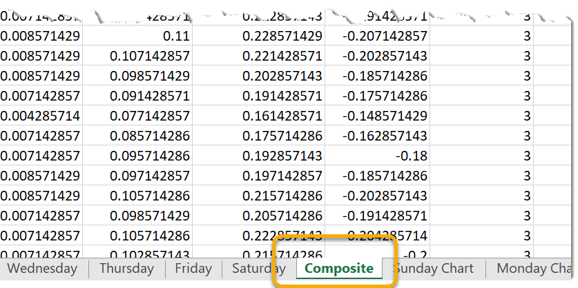
In this the values set by the Excel formula are based on the weekday tables:
| Composite Column | Method of derivation |
| Average | Average of the seven weekday values |
| Standard Deviation | Average of the seven weekday values |
| Av + 2SD | Average of the seven weekday values |
| Av - 2SD | Average of the seven weekday values |
| Maximum | Max of the seven weekday values |
| Minimum | Min of the seven weekday values |
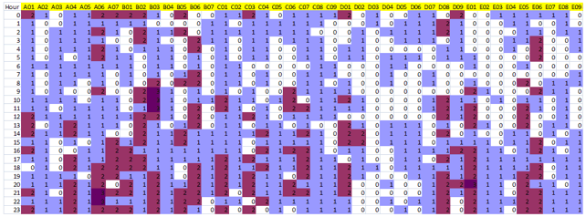
This function processes a single chart view of the data by working through the callouts sequentially. Throughout the process it maintains a tally of how many appliances were in use at each station in each hour of each weekday.
The numbers are whole appliances rather than averages.
Take for example any weekday-hour in the data being analysed (e.g. Sundays 00:00:00 – 00:59:59).
A station may have deployed a single appliance for all weeks bar one. It may have also deployed two appliances in just one week; the analysis report will show the deployment as two.
Unit Utilisation by station
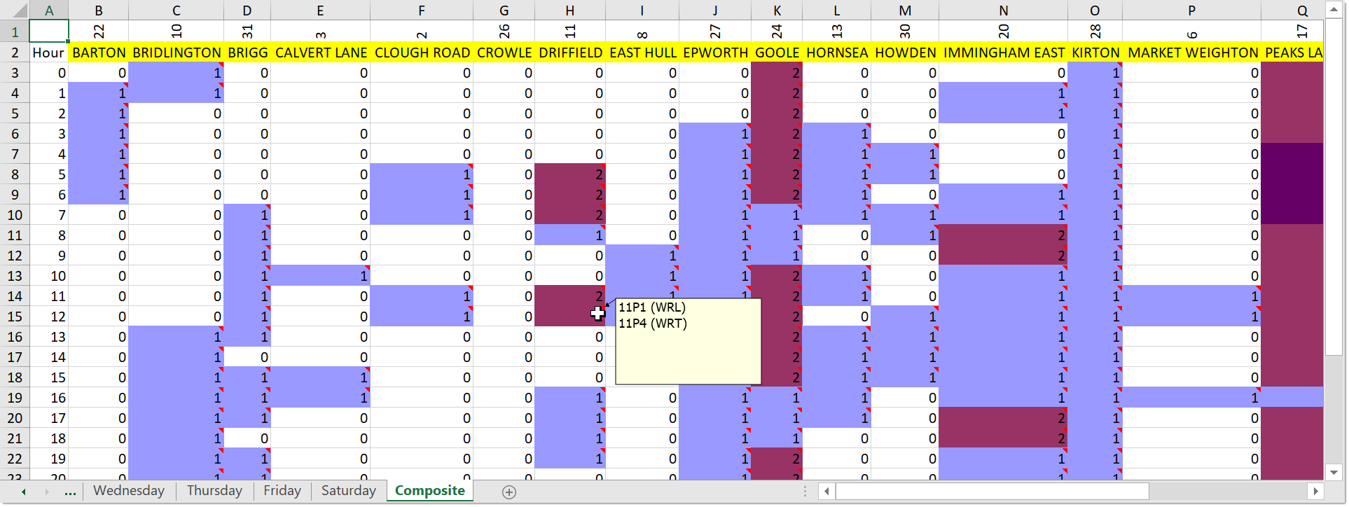
On a weekday chart, each station is represented by a column showing number of appliances deployed throughout the weekday. These cells are colour-coded.
In the example above, the data was for incidents in April 2006 and included all vehicle types (PRL and Aerial) which is why some stations are shown as having deployed three appliances.
Check Include vehicle information tickbox to include both Vehicle ID and vehicle class.
If you hover the mouse over a cell with a comment, a popup shows the vehicles that contributed to the value in that cell.
Note: In a model, all vehicles are just numbered 1, 2, 3.. but with historic data the vehicle ID is the call sign.
By applying a Vehicle Type filter an output can be created for just PRL or just Aerial vehicles.
This command also creates a ‘permanent’ view in the database. The name of the view is based on the name of the Excel workbook created.
For example, if a spreadsheet is named “export.xls”, then the view created is called “uuexport”.

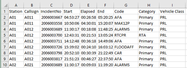
Day Chart shows the appliance usage for a particular day; the workbook includes a data worksheet of the day’s assignments and a separate worksheet with a Gantt-style chart.
- Data and charts are organised by station and then appliance.
- All items on the chart have tool tips to aid interpretation.
- The numbers in the Elapsed column are the total amount of time the appliances are used in the selected day.
Here is an example of a Day Chart based on a Turnout model:
Customising Colours
See here for information on customising the incident category colours.


